If your sustainability data isn’t driving action, the issue usually isn’t the data — it’s how you're seeing it. Raw spreadsheets and static charts don't cut it anymore. To make smart, strategic decisions about carbon, your team needs clear, contextualized visuals that highlight what matters most.
Effective carbon visualization helps you spot problem areas, track progress, and show the real-world impact of decarbonization strategies. Here are five ways to level up your approach.
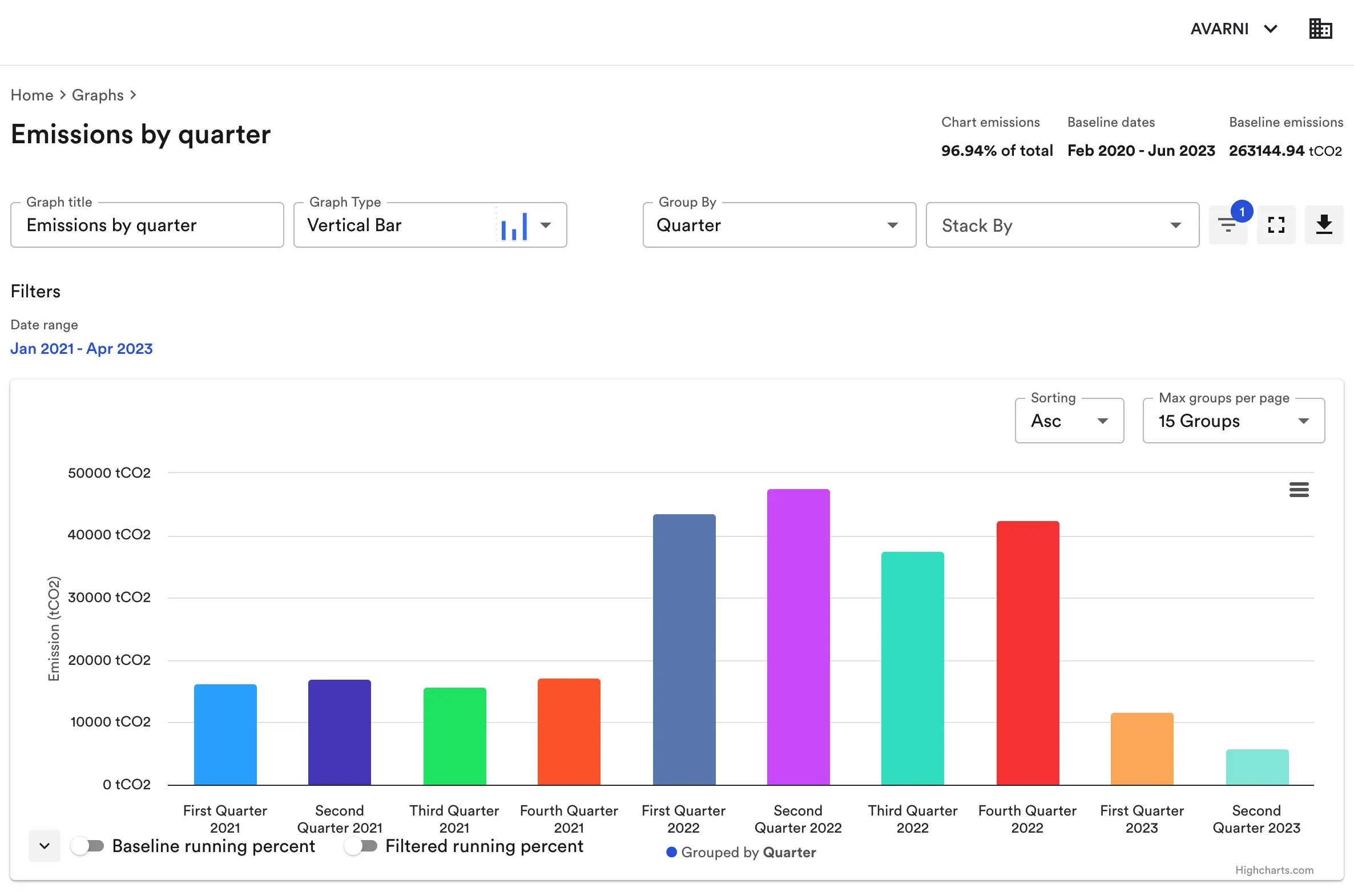
Show total emissions over time
Emissions data only becomes meaningful when you put it in motion. Tracking total emissions over time — on a monthly, quarterly, or annual basis — makes it easier to connect the dots between operational changes and environmental impact. Visualizing trends helps you pinpoint when emissions rose or fell and understand what drove those shifts. This is also key to communicating progress against net-zero or reduction targets, especially when engaging internal stakeholders or reporting publicly.
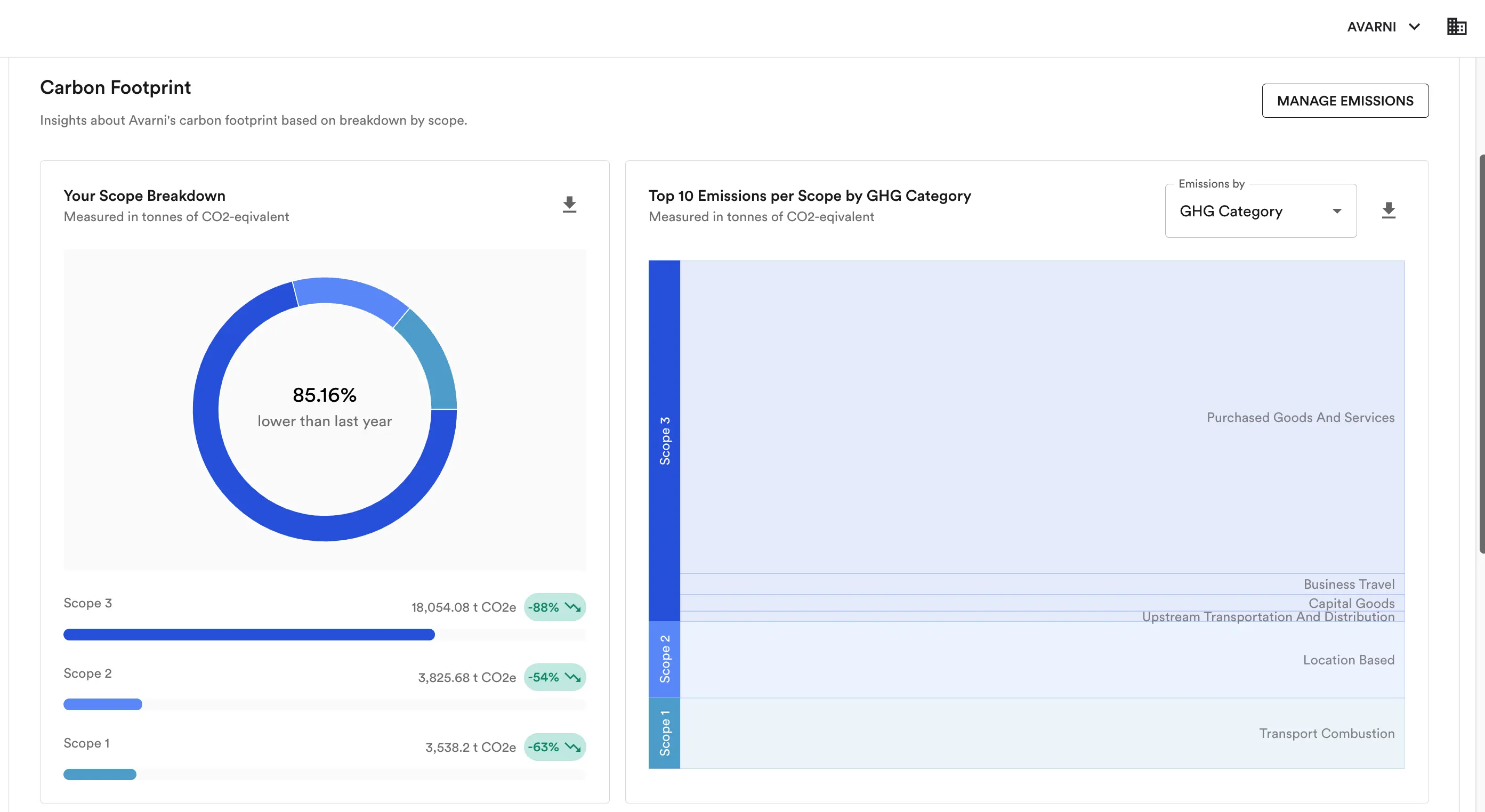
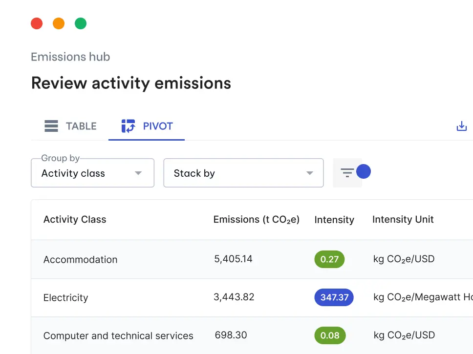
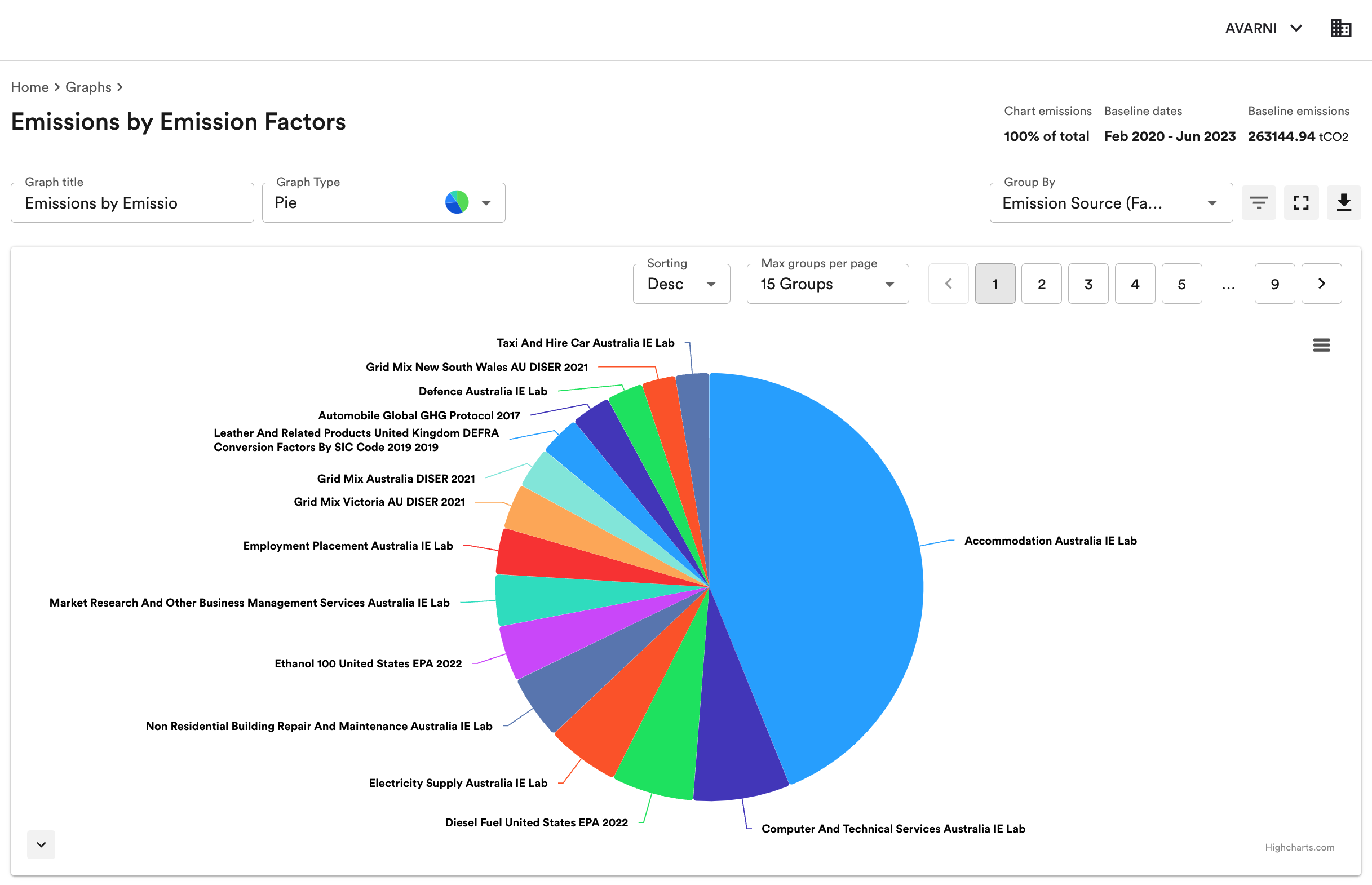
Break it down by scope and category
A total carbon number doesn’t tell you where the problems are—it just tells you there are problems. To actually reduce emissions, you need to know where they’re coming from. That means breaking your footprint down into Scope 1, 2, and 3, and then drilling deeper into individual Scope 3 categories like purchased goods, transportation, or capital goods. This level of granularity makes it easier to identify hotspots and prioritize action. It’s also a must for organizations aligning with CDP, SBTi, or other frameworks that require detailed emissions reporting.
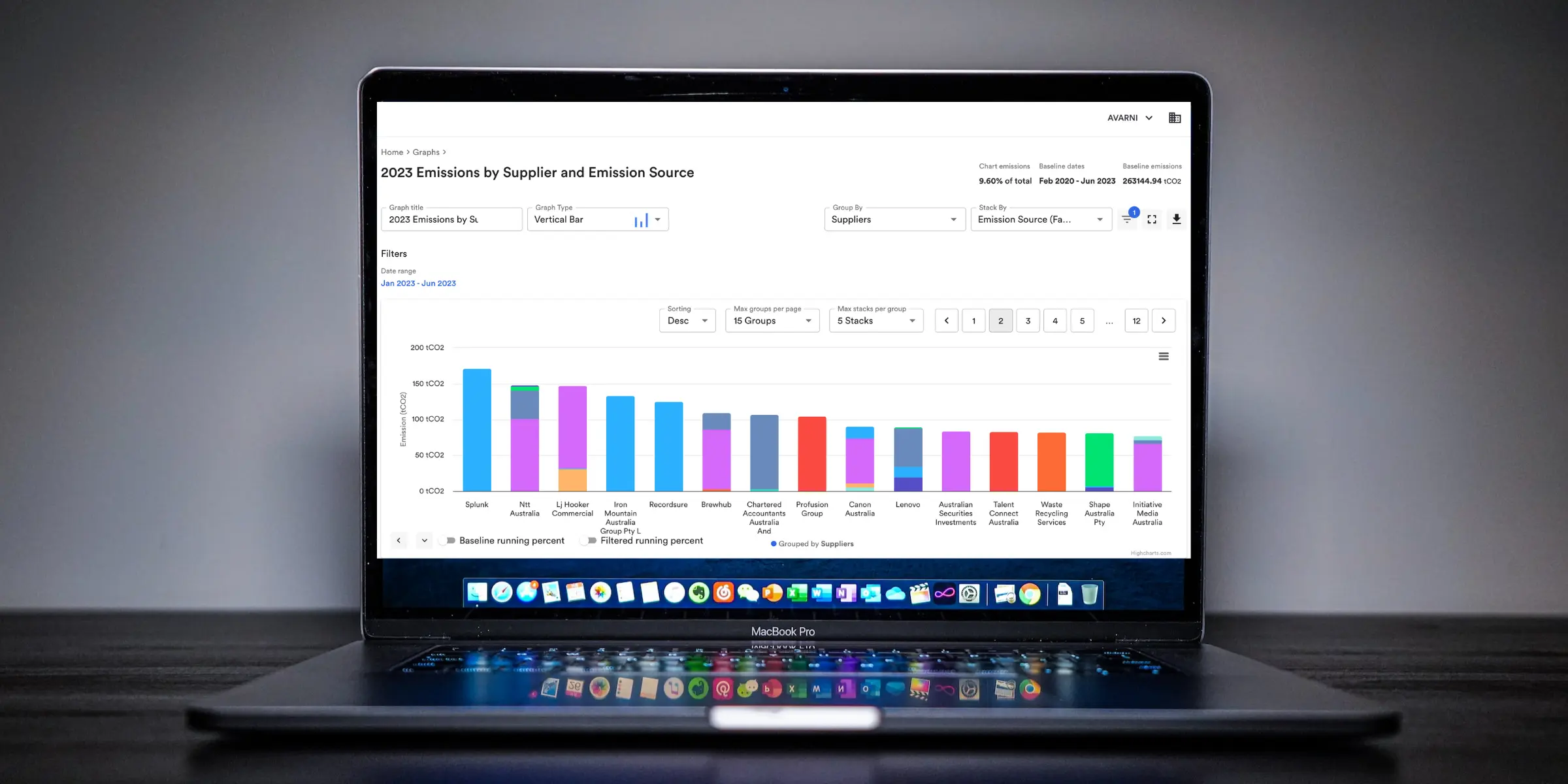
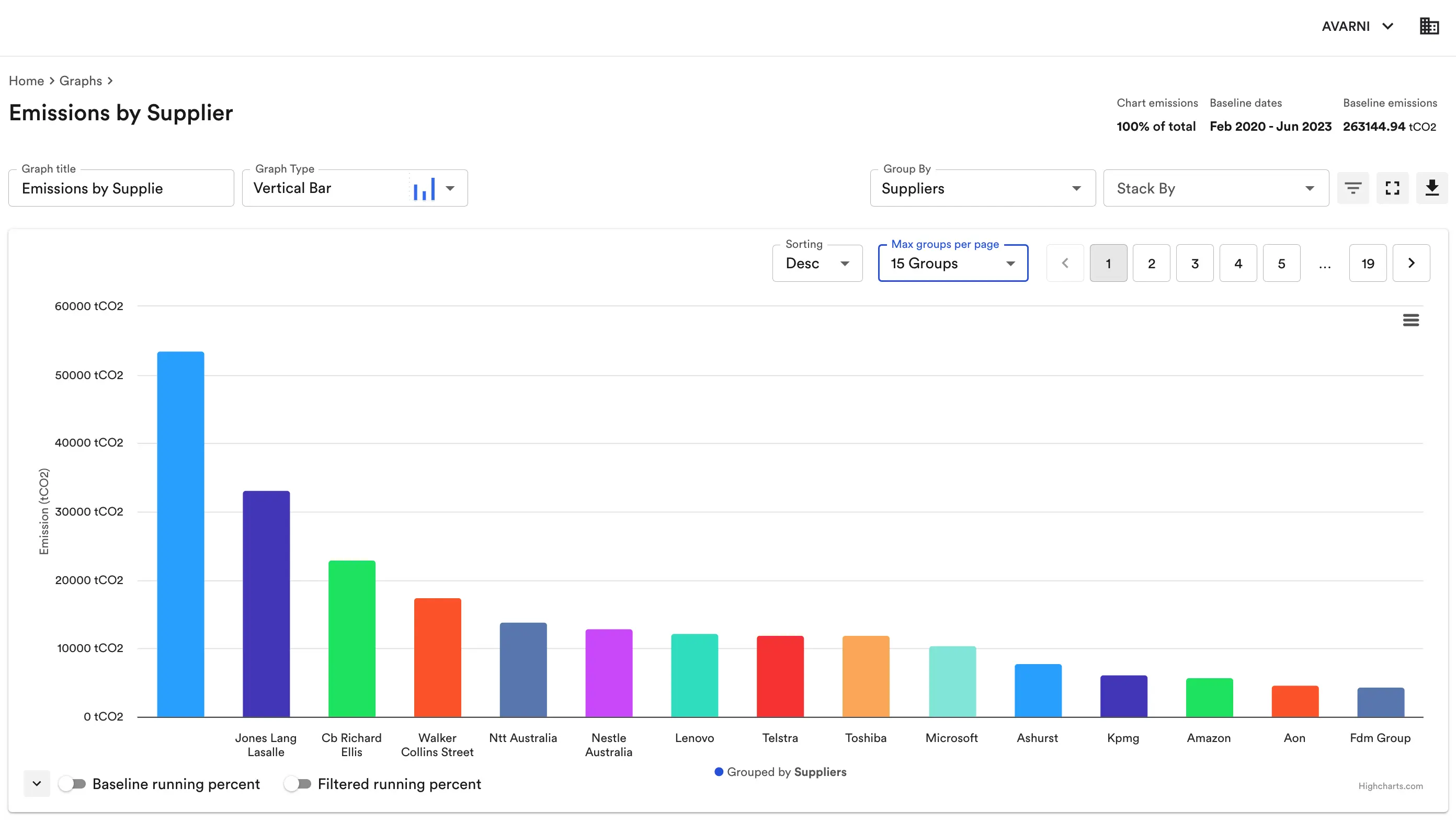
Compare suppliers or business units
One of the most effective ways to drive emissions reduction is through comparisons. Whether it’s benchmarking suppliers who deliver the same service, or looking at emissions intensity across different regions or teams, visualizing these differences makes underperformance impossible to ignore. This creates a foundation for accountability and encourages knowledge sharing between high- and low-performing areas. The clearer the gap, the easier it is to target solutions where they’ll matter most.
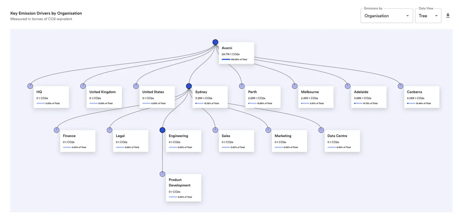
Map your supply chain
Even when emissions data is accurate, it often feels disconnected from day-to-day operations. Mapping emissions across your supply chain brings that data to life. By linking emissions to specific suppliers, products, and processes, you get a clearer picture of what’s driving your footprint and where action will have the greatest impact. It also helps align sustainability, procurement, and operations teams around a shared understanding of your emissions landscape.
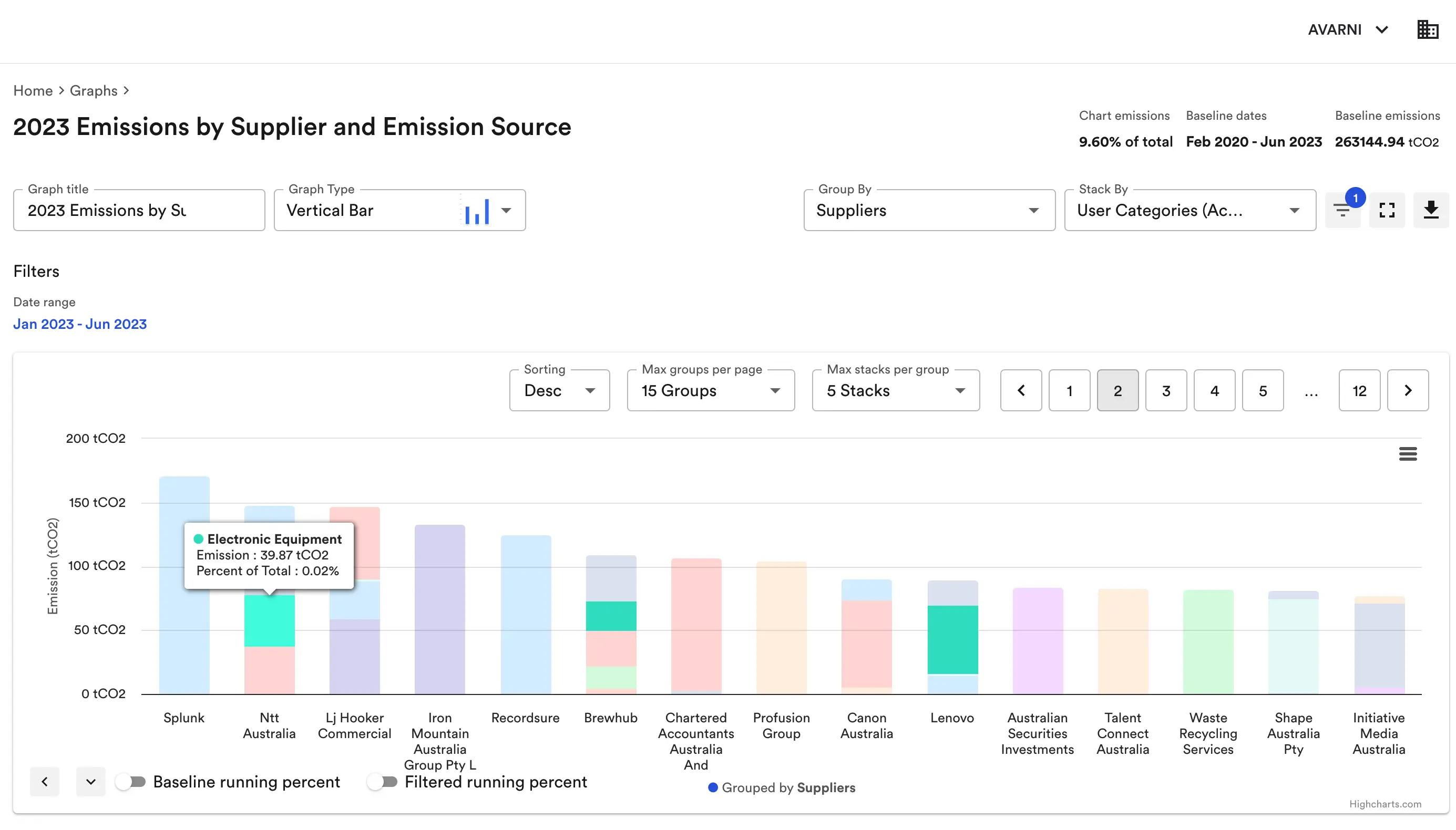
Focus on business-relevant context
Raw carbon data doesn’t resonate with most stakeholders unless it’s tied to business context. Instead of throwing numbers on a dashboard, show how emissions link to major operational areas — like logistics, supply chain, or capital expenditure. Visuals that highlight emissions by business function or supplier category help teams understand their own role in decarbonization. And when emissions visuals are aligned with company priorities or risk areas, they become far more actionable.
Summary
- Emissions trends over time reveal whether reduction efforts are working and help connect emissions to business events.
- Breaking down emissions by scope and category exposes key hotspots and meets major reporting standards.
- Benchmarking suppliers or departments helps drive accountability and uncover reduction opportunities.
- Value chain mapping connects emissions to real operations, making data more actionable across teams.
- Linking emissions to business context helps engage decision-makers and drive strategy.
Get these emissions visualizations for your organization
Avarni helps organizations go beyond measurement — into real emissions management. Our platform identifies your biggest carbon drivers, engages your suppliers to share their emissions data at no cost, and models future emissions based on reduction initiatives. Together, these tools give you the visibility and control you need to hit your net zero targets.
Ready to take the next step? Get in touch with us, or explore our core modules:
- Calculate emissions
- Emissions forecasting and initiative planning
- Tailor carbon reporting
- Supplier engagement